
My Role: Owned end-to-end design process as sole designer
The Team: 1 Product Manager, 1 Designer, 5 Engineers
Project Length: Jan 2024 – Apr 2024 (4 months)
Creating User-Friendly, Intuitive Table Designs
To make tutoring happen for over 250,000 students across the country, all non-student users in the BookNook app (tutors, administrators, and BookNook internal users) are analyzing, filtering, and interacting with large streams of data behind the scenes to facilitate sessions and understand outcomes. Our product team was hearing a lot of reports from internal and external users that tables were an area of high friction in the user experience and completing key tasks in the tables was tedious or unnecessarily convoluted. Simultaneously, an accessibility audit being done on our product at the time was flagging our tables with a lot of failures. To amend this, I re-designed the tables within our app to create a more intuitive, efficient experience that was better aligned with our users needs when it came to data within the app.
Overview

The Problem
Due to updates rolled out at different times by different teams, things like task flows, formatting, and interaction patterns were convoluted or needed refining. Clashing UX decisions had rendered our tables difficult to use. Some things that were called out repeatedly by users were filtering interactions, the task flow for bulk actions, and difficulty finding elements or actions in the UI.

Why was this an important problem to solve for our business? One of our business goals that quarter was to reduce churn when it came to annual contract renewal. Our teams had spent a lot of time focusing on the tutor and student experiences and realized it may be beneficial to our business goals to turn to the experience of other key players in the problem space like administrators. Tables and administrative views were often the first touchpoint our clients had with our product, so improving the experience for these users would hopefully create more value for them and encourage contract renewal.
The Business Problem
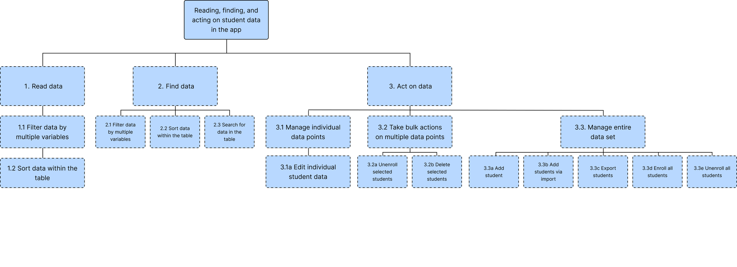
I wanted to further my understanding of the problem and look at the behavior of our users. What are their goals when it comes to student data and what tasks are they completing to achieve these goals? I wanted to do a task analysis to understand how they were working within tables to achieve their goals and ensure that the new solution was designed to more efficiently and appropriately support these goals.
Given our timeline, I knew I didn't have a lot of time to source and conduct user interviews with external user types like tutors or administrators. What I could do was sit down immediately with internal users and CSM's who interacted regularly with external users. Through these interviews, I was able to gather information on the goals and tasks related to the table experience and then analyze the tasks involved, getting a better understanding of the number of tasks and subtasks, sequence, complexity, and other things of that nature. The overarching goals we were able to define were that users needed to read, find, and act on data. Here's all of the tasks they were doing to achieve those goals.
Understanding Our Users
Breakdown of New Experience and Success Metrics
Based on what we were hearing from our users, I realized the design principles we needed to hone in on for the new solution: readability, discoverability, usability, and responsiveness. I looped in our engineers early on in the design process to pivot away from infeasible or unnecessarily labor-intensive solutions quickly and get the solution into the hands of our users faster.
We would measure success by how easily and quickly users were completing key tasks in the table and user satisfaction when it came to the new experience, two metrics we felt might be important when it came to increasing the chances of contract renewal based on the signals our users were giving us.
Consistent Rules for Data Formatting and Strong Organization
Hypothesis: Consistent rules for data formatting, strong organization, and strong visual hierarchy will allow users to read data more easily and efficiently.
Design changes:
Standardized rules for formatting and alignment of different kinds of data
Introduction of new elements like links and tags
Standardized rules and specs for spacing and padding


Organized, Easy-to-Use Set of Filters
Hypothesis: For large data sets, having a more organized, easier-to-use set of filters will allow users to find the data they need faster.
Design changes:
Updated filter components in design system, added new kinds of filters, and wrote thorough documentation
Changed some of the filters used in the table so filtering jobs were intuitive and straightforward
New page layouts (horizontal filter bar above table and vertical filter bar to the left of table)

Better Discoverability of Functionalities and Features
Hypothesis: Better discoverability and more logical organization of the functionalities and features in a table will allow users to act on data more easily.
Design changes:
Surfaced all table-wide actions as buttons in button bar for full visibility
Surfaced actions within rows as buttons


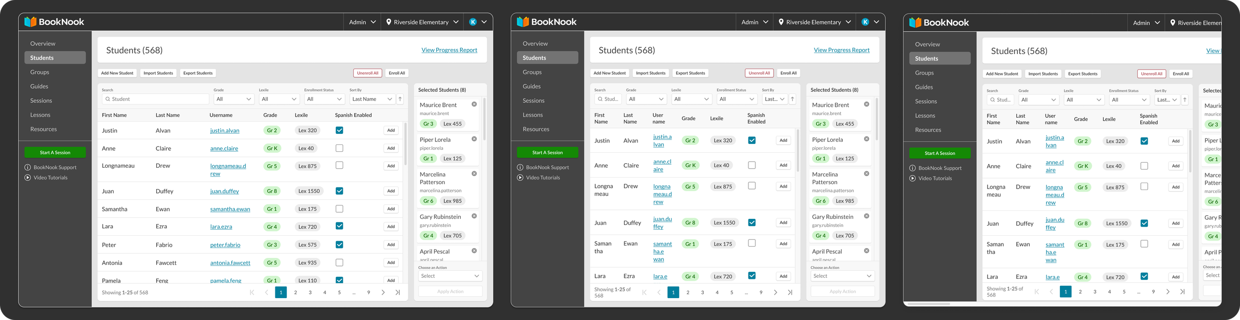
A Shopping Cart Pattern for Bulk Actions
Hypothesis: Introducing a shopping cart pattern for bulk actions is a more intuitive way for users to complete this common task more easily and with better error recovery.
Design changes:
Added a new shopping cart pattern for bulk actions to lean into a more intuitive task flow with better error recovery. The shopping card created an easy-to-scan visual of all of the user’s selected data in one place, something that had been missing in our old flow which involved checking checkboxes in each row to select data.

Responsive Designs that Support Content Reflow
It was imperative that the new designs supported optimal viewing across a wide range of viewport sizes, devices, and enlargement levels in order to be accessible. This meant that designs had to support content reflow which required considerable coordination with our engineers, whom I worked with to define rules for how layouts and structures would behave when content needed to reflow. I wrote documentation for things like alignment and wrapping and defined rules for use cases like 400% zoom or viewing on mobile devices.


Results
Before we rolled this solution out to 100% of our users, we ran some quick usability tests with some internal table users (again, making the tradeoff to only test on this user type in order to be able to release within our timeframe).
100% of the users tested reported being able to read data and find actions within the tables more easily and the task completion time for key tasks like filtering, table-wide actions, and bulk actions was lowered compared to the old experience. After release, we heard a lot of of positive anecdotal feedback from external users as well and saw a renewal of some key contracts in our client base. This project also revolutionized the way design collaborated with engineering, allowing us to set better processes in place for synchronous cross-functional collaboration where engineering was involved much earlier on.
