Supporting Accurate Pacing in Remote Tutoring Sessions
My Role: Sole designer owning end-to-end design process
The Team: 1 Product Manager, 1 Designer, 1 UX Researcher, 4 Engineers
Project Length: Feb 2023 – Mar 2023 (1 month)
Overview
Tutors had brought to our attention that the experience of pacing a remote session was difficult and required a heavy cognitive load, leading to many mistimed sessions. I spearheaded a revamped in-session experience with effective time-tracking tools and information surfacing to used across the app by thousands of tutors every day.
The Problem
Our experience critically under-communicated important data and signifiers that should convey how to pace a lesson or what to anticipate. Tutors were often finishing with time leftover and having to come up with their own supplemental material to fill time.
The Business Problem
The current experience was causing inconsistent session outcomes and leading to non-standardized material being taught. This undermined BookNook’s effectiveness as a learning intervention and was potentially affecting districts’ desires to renew contracts.
Initial Ideation
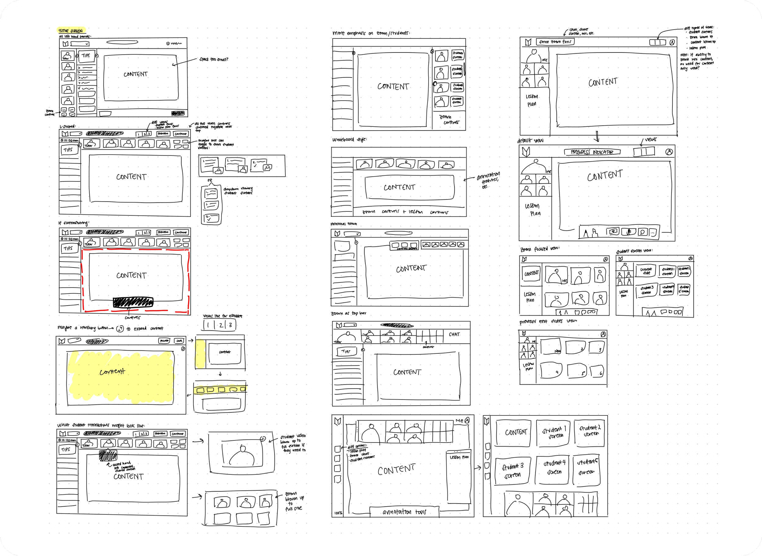
Early discussions with engineering surfaced some major constraints that quickly determined the direction and scope of our project. Many of our initial ideas had centered around a full re-design of the session experience.
However, we quickly realized the engineering lift required for this would be massive due to the way our session experience had been built on the backend. We pivoted instead towards releasing new features like time-tracking tools to supplement the current experience while pushing a complete overhaul into a future quarter.
New Session Experience
My focus for the new features was providing the right context and information while keeping it scannable and easy to digest. To align with constraints, I moved towards the idea of a “wrapper” around the lesson content where actionable data and signifiers would live.
Surfacing Glanceable Metadata to Provide Context
To help tutors understand where they were in the lesson, I introduced a top navigation bar containing a timeline and session timer. A key feature of the timeline was its glanceability, as users could know instantly where they were in the lesson (including important metadata about the current section), what section comes next, and how far from the end they were.
Actionable and Informative Data in the Lesson Plan
So users could understand the lesson material, I introduced a lesson plan containing a tips section and lesson outline. This would serve as a guard rail, especially for new tutors as it showed them the flow of the lesson and an overview of each section. Critical metadata like time estimates or the amount of content in each section would always be visible, while users could expand any section of the lesson outline to view the content.
A Clear Glimpse into Upcoming Screens
A next slide preview feature allowed users to see the next screen in the lesson, allowing them to anticipate what was next.
Impact
Aside from user feedback about certain features of this project gathered during semi-structured user interviews along the way, we were unable to determine the efficacy of the project as a whole due to the shifting priorities of the startup and a constantly shifting product roadmap. However, the features we did show to users like the new timeline and “Show Next Slide” preview received unanimous positive feedback from tutors, many of whom reported that the stress they had associated with remote BookNook sessions was alleviated with the rollout of these features.


